History of computer design: Macintosh
4-frogdesign || 5-Corporate focus || Conclusion || Bibliography & links


.jpg)


![]()
![]()
 The physical
design of the Macintosh has signs of this self-consciously
revolutionary atmosphere. The members of the team each
signed the cast of the inside of the case - though mainly
technicians would see it, they put their signature on their
work like the radical artists they felt they were. In a
durable case of carefully selected ABS plastic and with a
very fine texture that could make scratches less apparent,
it was meant to last. This concern for detail and endurance
included even the colour of the plastic, a tawny brown
called PMS 453 that Jerry Manock thought would age well,
unlike the lighter plastic of the Lisa which shifted with
prolonged exposure to sunlight to a bright orange
(Kunkel, 25).
The physical
design of the Macintosh has signs of this self-consciously
revolutionary atmosphere. The members of the team each
signed the cast of the inside of the case - though mainly
technicians would see it, they put their signature on their
work like the radical artists they felt they were. In a
durable case of carefully selected ABS plastic and with a
very fine texture that could make scratches less apparent,
it was meant to last. This concern for detail and endurance
included even the colour of the plastic, a tawny brown
called PMS 453 that Jerry Manock thought would age well,
unlike the lighter plastic of the Lisa which shifted with
prolonged exposure to sunlight to a bright orange
(Kunkel, 25).
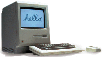
Jobs encouraged the Macintosh team to learn from mistakes made by the large team designing the Lisa. The thick band of plastic over the Lisa's screen reminded Jobs of a Cro-Magnon forehead, and he guided the physical appearance of the Mac to make it seem more cheerful (Sculley, 160). Since the Macintosh was to be easy to use, it should have a friendly appearance. Like the Lisa, the Macintosh has its circuitry, disk drive and display in a single unit with a keyboard and mouse, a self-contained design requiring only three cables, including the power cord, and contributing to a far easier assembly for the user than the increasingly established PCs. However, its disk drive is below the display, making it taller, narrower, more symmetrical, and far more suggestive of a face. Rather than looking cantilevered, the display has only a small recess below to elevate it and give some room for the keyboard, but this also enhances the impression of a chin. The simple anthropomorphic quality of the case and the few cables contribute to the Macintosh's identity as a computer that ordinary people could understand.
The design of the case was closely guided by Steve Jobs, and his name appears on its design patent along with its producers, Terry Oyama with Jerry Manock. Oyama later said, "Even though Steve didn't draw any of the lines, his ideas and inspiration made the design what it is. To be honest, we didn't know what it meant for a computer to be 'friendly' until Steve told us" (Kunkel, 26).
Manock designed the rear bucket of
the case while Oyama handled the front bezel, but there is a
very strong sense of integrity in the design. The two pieces
of the case are separated only by a narrow seam. Unlike the
hand-assembled Lisa, the Macintosh's assembly was automated
except for joining these two pieces in a fit so tight that
during the production, the factory's manager had to be shown
by Manock that they could snap together
(Kunkel, 25-6). The
mouse and keyboard reinforce the impression of integrity.
They share with the case a visual connection to Manock's
Apple II and III designs through chamfered corners. The
mouse reflects the shape of the computer itself: it has the
same dimensions as the front of the Macintosh with its
single button approximating the position of the screen.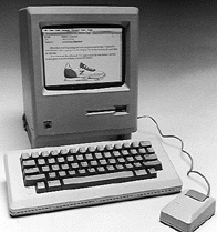
Though much taller than the Lisa and as long as wide (it is 9.75" wide and long and 13.5" tall), the Macintosh seems small, its front bezel rather than its rear bucket dominating its appearance. This visual effect comes in part from the case's suggestion of a head which instinctively draws attention and expectations to the face on its front. However, the effect is also accomplished through the careful design of the rear bucket to minimize its apparent size. The top of the case is angled by 7 degrees downwards towards the back of the case, giving room for a carrying handle and emphasizing the front of the machine - as Manock said, "The angled top instantly told you which direction the product was facing" (Kunkel, 24). Manock also cut a deep chamfer into the top edge of the back, making the back even less like the front and further reducing the apparent bulk of the rear bucket from a side view.
The Macintosh case manifests Jobs' vision of a computer as an appliance, freeing the user from interaction with circuitry. The architecture of the Macintosh, contrary to that of the PC, is closed in several important ways. Unlike IBM, which allowed the PC to be reproduced by other companies, Apple used many proprietary components essential for the function of the Macintosh, preventing its own clones. This decision to establish a "closed platform" has attracted much attention (e.g. Carlton, 163-6). However, the original Macintosh also does not allow the expandability of the PC or of earlier designs such as the Apple II; it does not have internal slots for additional circuitry. Steve Jobs wanted his product to be simple, easily set up and used immediately by almost anyone. He compared it to a crankless automobile, and like the Model T - which Henry Ford said could come in any colour wanted, so long as it was black - the Mac would be available in only one configuration. It did not allow additional circuitry or even more memory to be added. It was to be used only as intended (Sculley, 162-3).
The Macintosh case expresses this desire to control how the product could be used and changed. The tight fit of the two parts to the case can only be broken once several screws are removed, but they are deeply recessed at the back of the machine and require a specific and unusually long torque screwdriver. There is also a warning that if opened by someone other than an authorized technician, the warranty would be expired. This closed appearance extends to safety details. The vents, unobtrusive at the bottom of the sides and at the top of the computer, are shaped specifically to prevent anything from being poked through. An S-shaped curve in these vents prevents, for example, a child from touching the power supply with a paper clip (Kunkel, 25).
The way in which the Macintosh can be used is also strongly guided by physical design. The keyboard is like that of a typewriter except for the option and command keys, the latter sporting the Apple logo, that are on either side to accommodate both left and right-handed typists. It does not have the numerous function keys or even the cursor keys found on other computer keyboards. The lack of these keys is what Donald Norman calls a forcing device; without them, the user is forced to use the mouse. This was a very intentional strategy used by Jobs to ensure that the Macintosh would be used in the way designed, with a mouse rather than with the then-familiar key commands. This strategy also forced software developers to create applications that take advantage of the mouse-driven graphical interface, rather than reproduce existing software for the new platform (Levy, 194-5).
The ports on the back of the Macintosh are recessed to prevent users from trying to plug in non-compatible peripherals. Each of these ports is labeled with an easily understood icon developed by Apple according to the Deutsche Industrie Norman standard. These icons, on a clear plastic label applied by hand, help prevent injury to the computer and confusion for the user. To further simplify use, the power switch (the only switch on the computer; even ejecting a disk is controlled through the graphical interface) is located on the back where it cannot be hit accidentally, but has a smooth area around it in the otherwise textured plastic to guide the user's hand. Manock was proud to fine-tune his design in this way, and said, "That's the kind of detail that turns an ordinary product into an artifact." A similarly subtle detail is found on the underside of the handle at the top of the machine: ribs in the plastic there make it easier to grip the case (Kunkel, 24).
The concern for details on the Macintosh was unprecedented for a computer and gave it a sense of personality. Many Macintosh owners feel a relationship with their computer that extends far beyond its functions. Upon its release, it was frequently described, not in terms of its technology, but as an art object. One early article advises caring for the machine as if signs of its normal use as a tool were unfortunate blemishes - it suggests users "clean the Macintosh's exterior with a soft sable paintbrush, which you can buy at any art store" (MacWorld, Dec. 1984, p. 45).
The Macintosh is clearly shaped to provide as much uniformity in user experience as possible. However, the limitations of the machine were sometimes resented. The Macintosh initially sold to technophiles, early adopters of innovations who tolerated an unrefined product in favour of novelty. These early Mac users were immediately passionate, but Douglas Adams typifies them by saying, "What I . . . fell in love with was not the machine itself, which was ridiculously slow and underpowered, but a romantic idea of the machine" (Levy, 187). This lack of power was the direct result of Jobs' vision of democratizing computing with a simple, inexpensive and elegant appliance.
In order to reduce costs, Jobs' insisted that the Macintosh be sold with 128 k of RAM rather than the then hugely expensive 1 Mb placed into the Lisa. The Macintosh team wrote software to fit within this limited memory, but so little was left free that copying a disk had to be done in stages, requiring a frustrating number of disk changes (Levy, 187-9). A hard drive could have elevated some of this problem, but Jobs refused to include one as it would not only increase the price, but also make the machine less elegant; Jobs had long thought that noise from the necessary fan made a computer seem "inelegant" and impersonal (Kunkel, 16).
 Unlike Jobs, the main hardware engineer,
Burrell Smith, anticipated that sales might be slow due to
the Macintosh's lack of power. Jobs had forbidden the
Macintosh team even to provide the capacity for more memory,
but Smith defied him, building the potential for expansion
to 512 k in the design. The original 128 k Macintosh could
not be expanded (see
its
technical specifications), but Apple was able to market
a new 512 k Macintosh by October 1984, only 9 months after
the original release (see
technical
specifications for the Mac 512 k and the later
Mac
512 ke). An advertisement for an even later version, the
Macintosh Plus, played with Smith's surreptitious insistence
that the Macintosh be potentially as capable as possible;
signaling new peripheral ports, the ad's headline reads
"Look what our own engineers did behind our back" (Apple ad
in Byte, June 1986, p.
49).
Unlike Jobs, the main hardware engineer,
Burrell Smith, anticipated that sales might be slow due to
the Macintosh's lack of power. Jobs had forbidden the
Macintosh team even to provide the capacity for more memory,
but Smith defied him, building the potential for expansion
to 512 k in the design. The original 128 k Macintosh could
not be expanded (see
its
technical specifications), but Apple was able to market
a new 512 k Macintosh by October 1984, only 9 months after
the original release (see
technical
specifications for the Mac 512 k and the later
Mac
512 ke). An advertisement for an even later version, the
Macintosh Plus, played with Smith's surreptitious insistence
that the Macintosh be potentially as capable as possible;
signaling new peripheral ports, the ad's headline reads
"Look what our own engineers did behind our back" (Apple ad
in Byte, June 1986, p.
49).
To the Design
Revolution (1983-85)![]()
Home || Introduction || Historiography || 1-Cottage industry || 2-Emerging standards || 3-Macintosh
4-frogdesign || 5-Corporate focus || Conclusion || Bibliography & links