History of computer design: Macintosh Plus
4-frogdesign || 5-Corporate focus || Conclusion || Bibliography & links


.jpg)


![]()
![]()
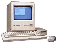 The first
major update came with the Macintosh Plus, announced in
January 1986. Manock and Oyama's physical design remained
largely intact even for this machine, but within it was
clearly more suited for a business market. It came with a
full megabyte of memory which could be further increased to
four. An industry-standard SCSI (small computer system
interface) port was added to its back for high-speed hard
drives, scanners, and other peripherals (see
technical
specifications). Frogdesign made a few small changes to
the original design of the case, embedding port icons into
the plastic and reducing the plastic barrier that Manock had
added so as to allow more standard cables to be attached.
Over the course of its production, its colour changed from
the original Macintosh's brown to introduce a warm grey
known as "platinum" which was favoured by frogdesign and
would be the colour of every following desktop computer from
Apple until the mid-1990s
(Kunkel, 61).
Frogdesign nonetheless regarded the changes made for the
Macintosh Plus as insignificant, and they declined any
credit for them
(Kunkel, 47).
The first
major update came with the Macintosh Plus, announced in
January 1986. Manock and Oyama's physical design remained
largely intact even for this machine, but within it was
clearly more suited for a business market. It came with a
full megabyte of memory which could be further increased to
four. An industry-standard SCSI (small computer system
interface) port was added to its back for high-speed hard
drives, scanners, and other peripherals (see
technical
specifications). Frogdesign made a few small changes to
the original design of the case, embedding port icons into
the plastic and reducing the plastic barrier that Manock had
added so as to allow more standard cables to be attached.
Over the course of its production, its colour changed from
the original Macintosh's brown to introduce a warm grey
known as "platinum" which was favoured by frogdesign and
would be the colour of every following desktop computer from
Apple until the mid-1990s
(Kunkel, 61).
Frogdesign nonetheless regarded the changes made for the
Macintosh Plus as insignificant, and they declined any
credit for them
(Kunkel, 47).
A more significant visual change appeared on the keyboard, which was altered for acceptance by the business market to include both a numerical keypad and cursor keys. Joanna Hoffman, one of the original Mac team, defended this abandonment of the "forcing device" that ensured that the mouse be used as Jobs' intended, saying, "When you're trying to spread a religion you have to be pretty strict at first. After you get them converted, you can relax" (Levy, 194-5).
To the Apple IIgs
![]()
Home || Introduction || Historiography || 1-Cottage industry || 2-Emerging standards || 3-Macintosh
4-frogdesign || 5-Corporate focus || Conclusion || Bibliography & links