History of computer design: Macintosh SE
4-frogdesign || 5-Corporate focus || Conclusion || Bibliography & links


.jpg)


![]()
![]()
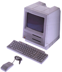 The
Macintosh SE, announced in November 1986, offered an
internal hard drive - along with the necessary fan that Jobs
had considered inelegant - and an expansion slot (see
technical
specifications). This slot is apparent from a removable
plastic piece on the back of the machine. A similar
removable piece hidden on the front bezel allows a second
floppy drive to be added instead of the internal hard drive;
Apple also offered an SE with this configuration. The SE has
different port for its mouse and keyboard using the ADB
(Apple Desktop Bus) technology that had been introduced the
previous month with the Apple IIgs. Its case reveals no
other functional improvements over the Plus, but it
nonetheless has a significantly different appearance.
The
Macintosh SE, announced in November 1986, offered an
internal hard drive - along with the necessary fan that Jobs
had considered inelegant - and an expansion slot (see
technical
specifications). This slot is apparent from a removable
plastic piece on the back of the machine. A similar
removable piece hidden on the front bezel allows a second
floppy drive to be added instead of the internal hard drive;
Apple also offered an SE with this configuration. The SE has
different port for its mouse and keyboard using the ADB
(Apple Desktop Bus) technology that had been introduced the
previous month with the Apple IIgs. Its case reveals no
other functional improvements over the Plus, but it
nonetheless has a significantly different appearance.
The SE case has the same iconic appearance as the original Macintosh, but it has a less exuberant, modernist Snow White design in the platinum colour first used by the Apple IIgs. Jerry Manock's signature chamfers are replaced with simpler 3 mm curves, and the detailing around the floppy drive has been removed, leaving only a rectangular slot. Both floppy slots are part of recessed areas on the front bezel that are wider but of the same depth and spaced regularly with the three Snow White lines that appear between them. The carefully constructed vents on the sides and at the top of the original Macintosh are also replaced and integrated instead into surface detail. There are short vertical lines at the base of the front and sides of the SE, and some extend through the plastic to provide venting. Additional venting is provided by a rectangular patch of deep Snow White lines on the back of the machine.
The design of the SE has a colder and more rigorous appearance than the original Mac. Its front bezel has a slight outward curve to it which prevents it from appearing flat, but the loss of the curved disk drive styling and the broad chamfers gives it a somewhat formal and utilitarian expression. This case design was used again with little change for a more powerful version called the Macintosh SE/30 in January 1989 (see technical specifications for the Mac SE/30).
To the Macintosh II
![]()
Home || Introduction || Historiography || 1-Cottage industry || 2-Emerging standards || 3-Macintosh
4-frogdesign || 5-Corporate focus || Conclusion || Bibliography & links